
The Meridian Design System
The Problem
When I joined Assent in 2018, the design landscape was chaotic and unorganized. Although there was a design guide, it was outdated and hidden within the product design team. The guide was neither well-shared nor well-followed. The lack of a unified design language resulted in a growing amount of design debt, inefficient components and patterns, and over two dozen font styles and colour variations. Designers were still creating components from scratch, and although there were efforts to do critiques and team design reviews, not having a centralized source of truth was adding to the problem.
Rebranding Context
Assent had recently concluded a Series C funding round towards the end of 2021 and was on the verge of a new growth phase, with a specific focus on the European markets. To achieve this, a complete rebranding campaign was launched. This marked a significant turning point for us, providing us with the ideal opportunity to enhance the standard of design through the implementation of Meridian, our very first official design system.

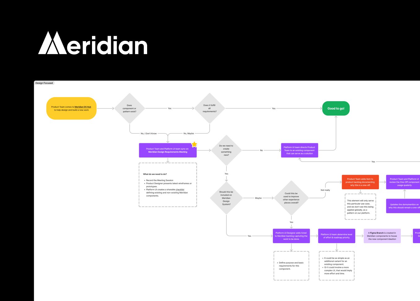
Collaboration
One challenge was coordinating across multiple product and stakeholder teams. The content guidelines, for example, needed significant realignment. While the focus was on updating the legacy platform to align with the new brand, developing a new platform offered a clean slate for leveraging Meridian. It was a balance of updating the old while pioneering the new.
Throughout the design process, stakeholder check-ins played a pivotal role. We faced some pushback over our choice of primary colours, which differed from the web marketing team's direction. But we stood our ground, believing that a refreshed product UI would invigorate our user base.
Key Components of the Design System
Our foundational elements were shaped largely by the new brand guidelines. We narrowed down a large colour palette into categories that met the basics of good accessibility and semantic requirements. (I'll include images in the case study to provide a detailed view.)
Before

After


The Process
To develop Meridian, we audited our design guidelines and studied design systems from industry leaders like Shopify and IBM. We conducted stakeholder interviews with teams from brand marketing, creative, engineering, and product to gather insights and feedback. These inputs shaped our strategy for Meridian, which was designed in Figma and documented in Confluence. As our platform UI teams built upon Meridian, we also incorporated its elements into a UI hub for consistency across our products and services.
Outcomes & Impacts
Introducing Meridian as a centralized source of truth was a game changer. A dedicated team and set of standards helped us move away from siloed efforts towards a more cohesive and efficient design practice. Gone are the days of component and patterns being designed without oversight and input from our platform UI team. The guidelines empowered other teams to chip in, freeing up our core platform teams. Win Loss insights from 2023 showed that our UI and UX were among the top 5 decision drivers for the European market.
Reflection & Learnings
One lesson I've learned from this experience is the importance of a clear strategy and roadmap. It provides not just a direction but a narrative that people can buy into. Despite resource limitations, we found ways to empower other teams to contribute, making the system a shared investment and not just a one-team endeavour.