


Turned four disconnected and complicated SEO steps into one actionable workspace
How I led 0-to-1 product design and brand identity for Dtermin—disproving minimalist design assumptions through user research to build a unified, high-utility SEO intelligence platform.
The Challenge
Demystifying SEO for Small Business Owners
Search engine optimization is critical for organic customer acquisition, yet small business owners face severe barriers:
- Existing SEO platforms like SEMrush and Ahrefs are built for seasoned marketing analysts, overwhelming non-specialists with dense technical metrics.
- Small business owners don't just need a massive list of keywords—they need to know what specific actions to take next to drive qualified traffic.
- Conflicting advice and complex configurations cause entrepreneurs to abandon organic lead generation altogether.
Dtermin was conceived to cut through the keyword chaos and provide small business owners with a clear, guided path to search-driven customer acquisition.
Brand Identity & Strategic Framing
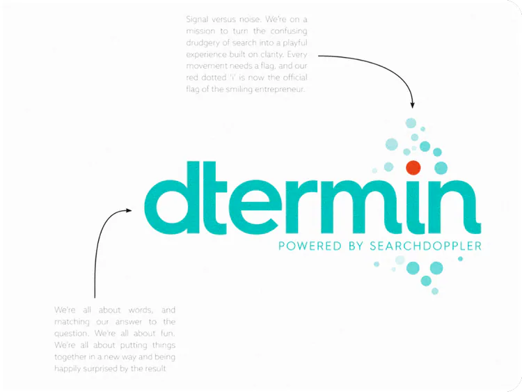
I led the 0-to-1 brand creation and positioning workshops, establishing an identity built on clarity, focus, and approachable expertise:
- Designed a vibrant, modern visual identity and cohesive brand system.
- Established a friendly, jargon-free voice and tone across product copy and marketing collateral.
User Research & Disproving the "Simplicity" Hypothesis
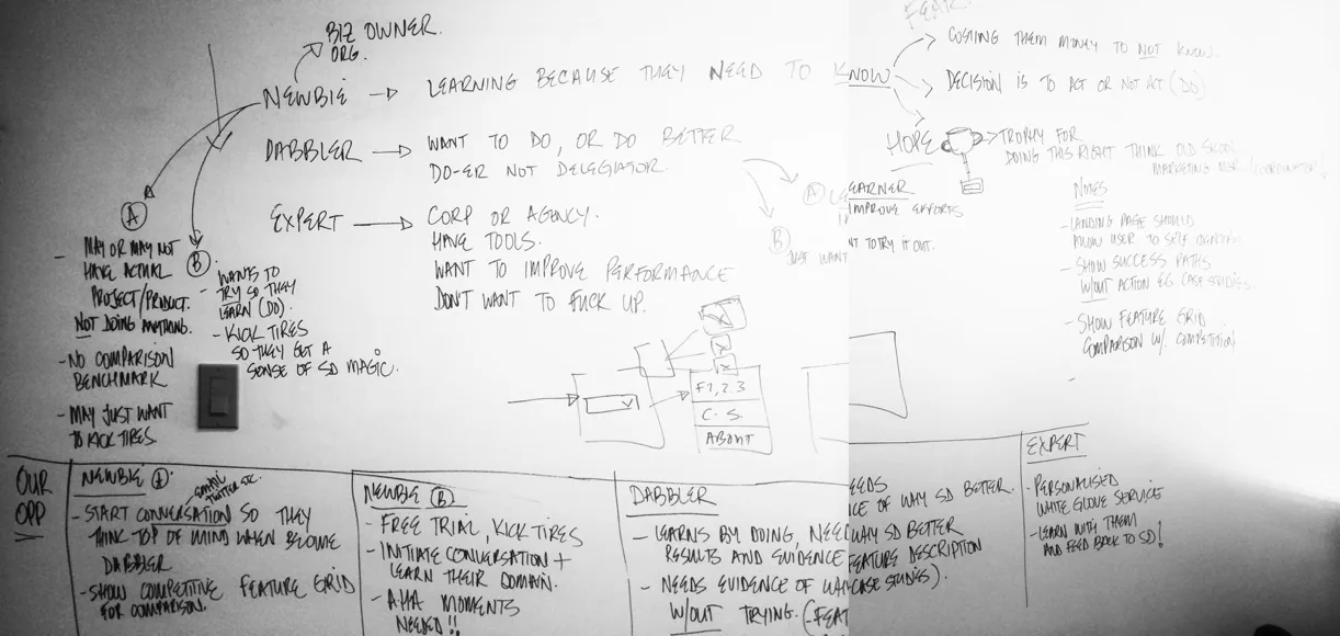
We conducted extensive user research, rapid whiteboarding sessions, and iterative usability testing with small business owners.
The Surprising Discovery
Our initial hypothesis assumed that non-technical users wanted an ultra-minimalist interface with minimal data points. Empirical usability testing proved our hypothesis wrong:
- When presented with hyper-simplified results, users felt the platform was shallow or lacked algorithmic accuracy.
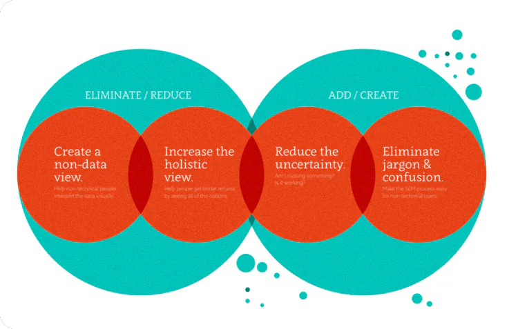
- Users actually demanded rich data returns, but required clear contextual prioritization and actionable guidance on how to interpret them.
Product Architecture
The Single-Screen Command Center
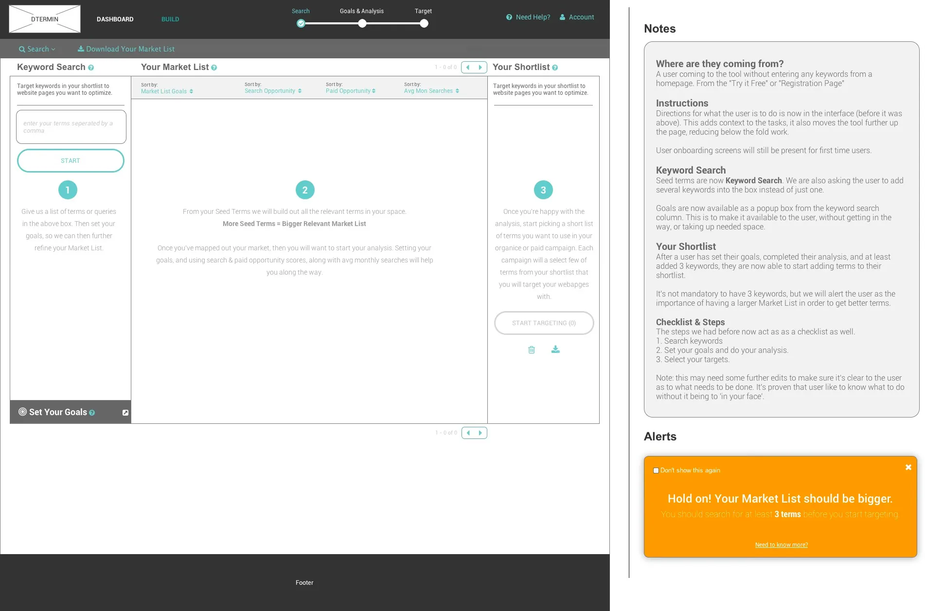
Armed with our research insights, we re-architected the initial multi-step wizard into a unified, high-utility workspace:
Unified Four-Stage Progression
Rather than forcing users through disconnected steps, we consolidated the four core jobs to be done into one seamless view:
- Onboard and define intent with the core product or service offering.
- Explore the keyword corpus with rich algorithmic query matching.
- Filter and target high-intent terms with actionable search volume and intent scoring.
- Execute and deploy with integrated content suggestions and next-step guides.
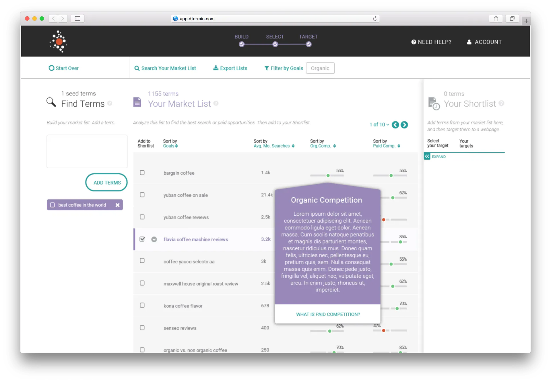
Actionable Next-Step Guidance
To solve the post-search paralysis, we paired every keyword cluster with contextual execution recommendations—advising users exactly where to deploy terms across page titles, meta descriptions, and blog content.
Strategic Outcomes & Lessons Learned
- Replacing complex multi-step navigation with a consolidated single-screen workspace significantly increased user workflow completion.
- Testing disproved the team's initial assumptions, demonstrating how user research prevents shipping well-intentioned but fundamentally flawed minimalist products.
- Delivered a tight harmony between visual brand positioning and intuitive SaaS utility.
Key Takeaways & Executive Reflection
- True UX simplicity means giving users the depth of data they need to trust the system, paired with the cognitive scaffolding required to take action effortlessly.
- Great design leaders rely on user testing to challenge and overturn their own foundational design hypotheses before investing in full production builds.