


Unified a fragmented health platform and eliminated onboarding dropoff
How I led the UX and brand transformation of Curatio's digital health platform—cutting onboarding friction through ethnographic research and unifying mobile and desktop architectures.
The Challenge
Living with a chronic health condition can be profoundly isolating. Curatio was created to provide a dedicated, secure peer-support network where patients could find community, track their health, and access trusted clinical resources.
However, the legacy platform faced critical scaling and accessibility barriers:
- Patients managing pain or fatigue were dropping out during a lengthy, clinical onboarding process.
- Separate mobile and web implementations made feature delivery expensive and created inconsistent user experiences.
- The legacy app felt sterile and clinical rather than warm, welcoming, and empathetic.
The mandate was to transform Curatio into a unified, responsive platform that met rigorous healthcare accessibility standards while delivering deep emotional resonance.
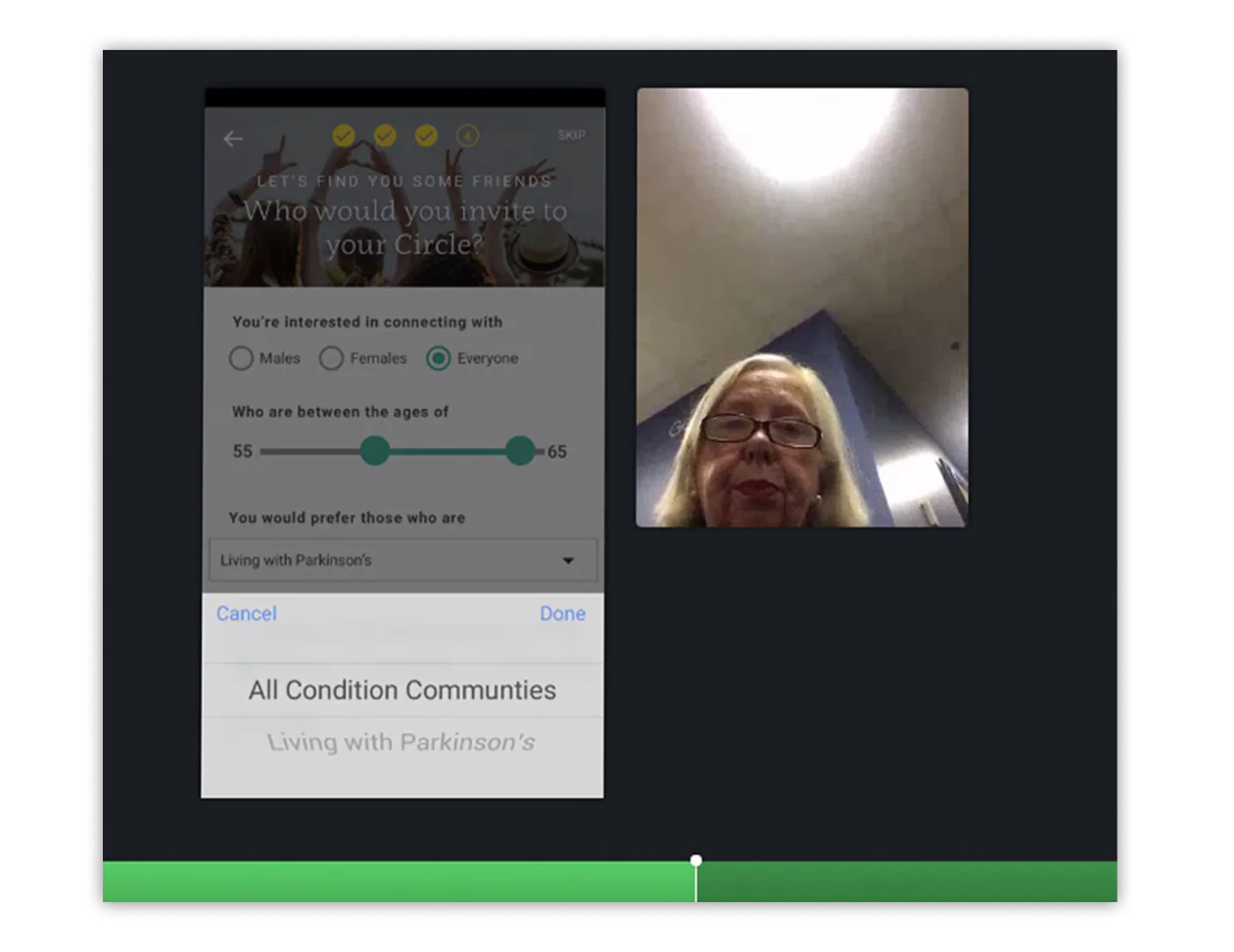
Research & Discovery
I established a continuous, ethnographic research practice to understand the physical and emotional realities of users managing chronic conditions (such as cardiovascular disease, autoimmune disorders, and cancer recovery):
- Tested low- and high-fidelity prototypes every few days with real patients and clinical coordinators.
- Measured time-to-onboard, cognitive friction points, and self-reported emotional comfort.
- Ensured high-contrast typography, large touch targets, and minimal input friction for users with dexterity or vision challenges.
Product Architecture & Interaction Craft
Streamlined, Low-Friction Onboarding

I re-engineered the onboarding flow around progressive disclosure:
- Reduced mandatory registration fields to the bare minimum needed for community safety and condition matching.
- Transformed clinical profile configuration into friendly, bite-sized micro-steps.
- Decreased onboarding completion times across all user cohorts within the two-week testing cycle.
Empathetic Visual & Brand System
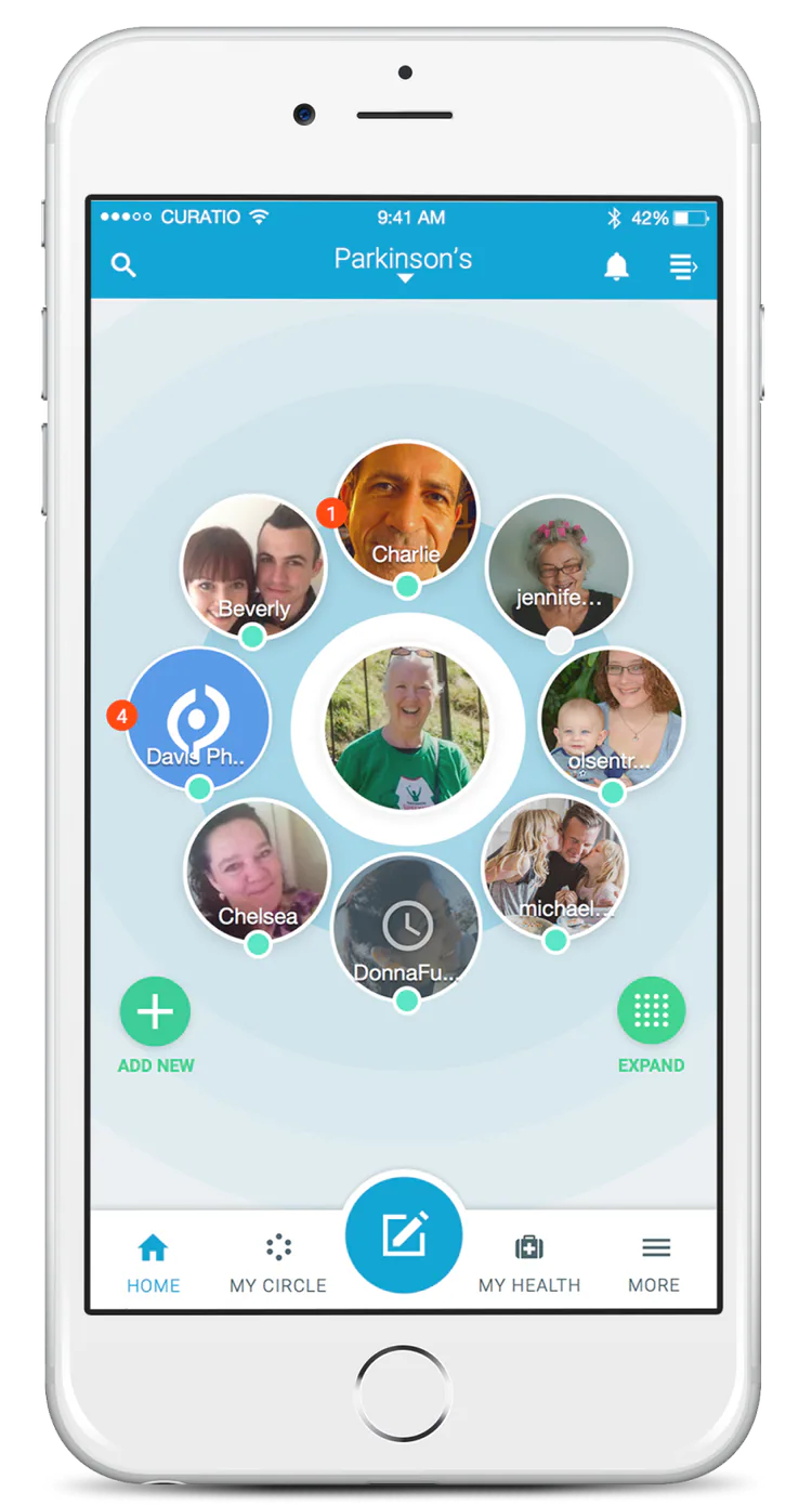
To move away from an intimidating hospital feel, I established a cohesive design language:
- Soft, calming color palettes and humanistic typography replaced harsh clinical tones.
- Authentic, empathetic photography and accessible iconography set a welcoming foundation.
- Predictable navigation aligned with native iOS Human Interface Guidelines.
Reimagining Community: "Circle of Friends"
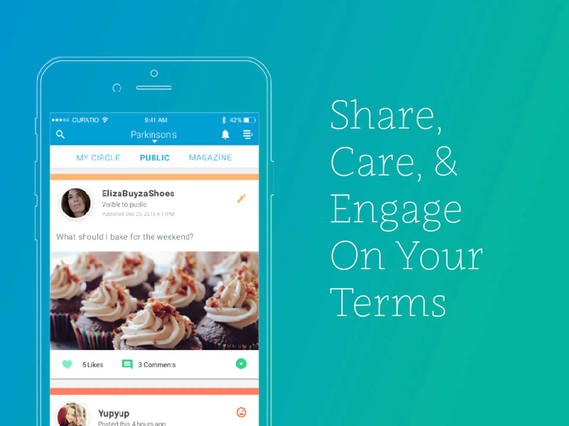
I redesigned Curatio’s primary peer feature, the Circle of Friends:
- Introduced an activity-based toggle allowing users to view peers based on active status, condition milestones, or recent engagement.
- Supported both public community forums and private 1-on-1 messaging to accommodate varying comfort levels with sharing health data.
Responsive Multi-Platform Parity
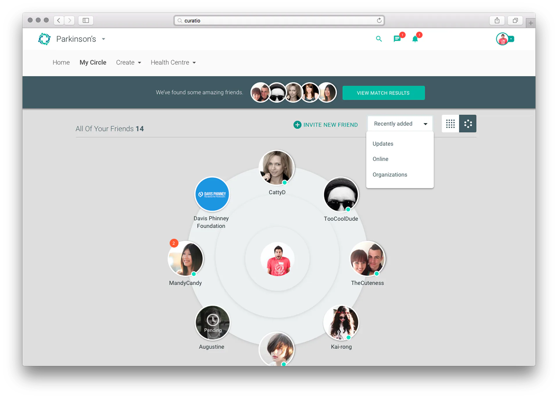
Partnered with engineering to establish a shared responsive architecture, bringing full desktop accessibility to patients, clinicians, and enterprise health partners who manage support programs from desktop computers.
Measurable Outcomes & Business Impact
- Rapid iterative testing delivered a significantly streamlined onboarding flow, eliminating user drop-off.
- Replaced fragmented codebases with a single responsive platform, cutting development overhead and maintenance costs.
- The empathetic visual identity and intuitive community interactions drove sustained peer engagement across complex chronic disease categories.
Key Takeaways & Executive Reflection
- When designing for health tech, cognitive load and physical accessibility directly determine whether a patient in need feels supported or abandoned.
- Direct, continuous user research with patients is the only way to uncover the unstated anxieties that drive health-app abandonment.